Compass
A collaborative process to create a feature that lives seamlessly among a family of easy to navigate design elements.
Role
Lead Designer
Wireframes
UI Design
Prototyping
User Research
Industry
Real-Estate
Design Tools
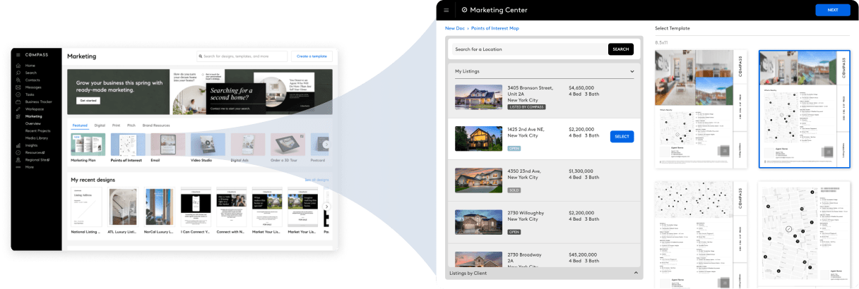
The ask
“I want to be able to share points of interest in a map on my listings and sales sheets.”
Details
- “I want it customizable.”
- “I want to use it for multiple designs.“
- It should match the global and specific agent/team branding.
- Needs to fit within layout builder.
Pain Points
- Copying and pasting screenshots of Google maps doesn’t look nice.
- I can’t include the specific locations I want to all on the same map without a lot of work.
- I can’t save maps to use later with new locations, need to start all over every time.
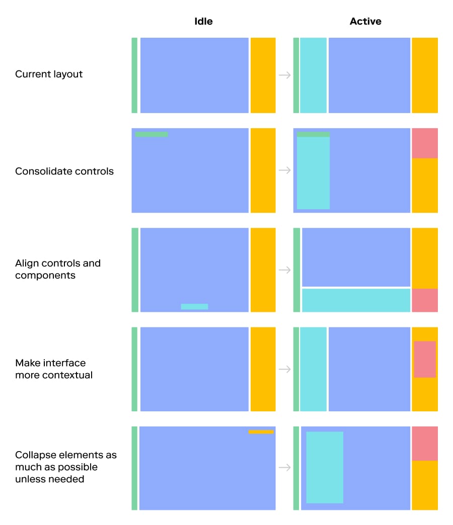
Building into an existing framework
Compass created a very in-depth system for agents to make all the communication materials they need. This system has a defined framework so new features must adhere to the existing structure for consistency.
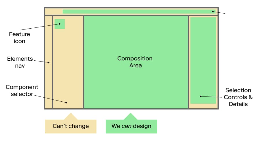
Can the framework itself be improved?
Rearranging the layout with the goal of simplifying and consolidating.
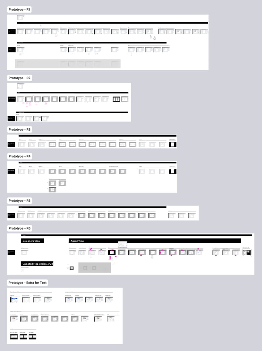
Rapid prototyping for testing
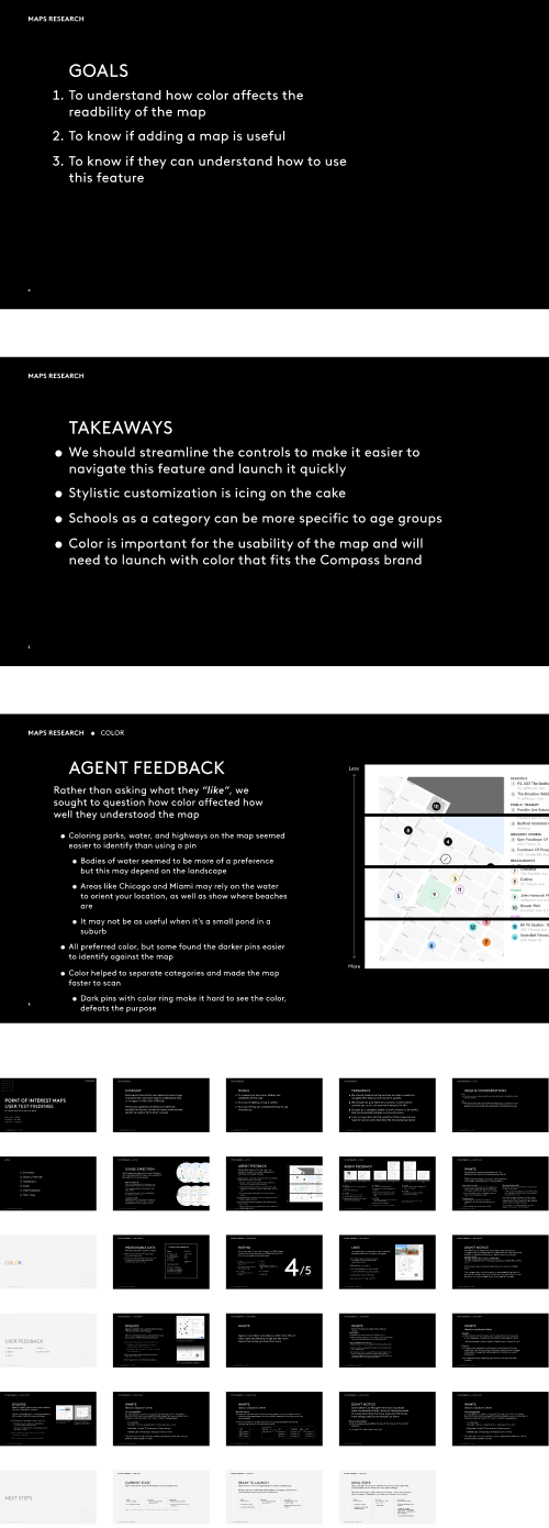
We had the benefit of working directly with Compass Agents, some of whom requested this feature, so we created multiple rounds of prototypes to perform tests with them.
Their feedback informed such topics as:
- Overall understandability of the feature
- Regional differences and how the feature could work differently for different types of environments, such as urban vs. suburban
- Functionality of the design platform
- Usage of colors and branding
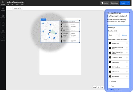
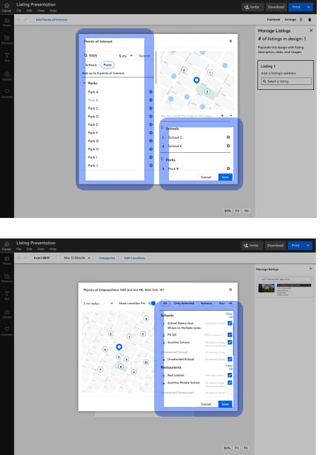
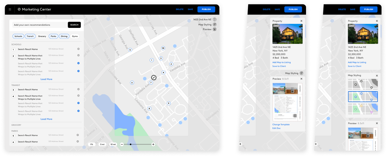
Map Controls in Side Panel
Testing Feedback:
Agents will need more categories, so expanding the space for this module is necessary.
Helps to consolidate the space, but could be limiting.
Next version: Try for more control
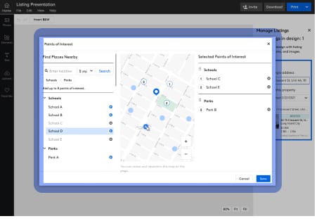
Map Controls as Modal
Testing Feedback:
Modal creates better focus on the current task—creating the map+list
A bit too complicated to sort categories, they want control but prioritize convenience.
Next version: Simplify selections
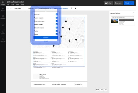
Reduce Complexity
Testing Feedback:
Participants much more easily understood the checkboxes in the list.
But still wanted it to be simplified further
It may be too complex to have two lists displayed at once—consolidating them into one is easier to browse
Next version: Simplify as much as possible
Minimize All Controls to Categories
Testing Feedback:
Participants wanted a way to be able to find specific locations.
Simplifying the categories into just a list of checkboxes is much lighter, but limits control
Next version: Balance simplicity and control back to the more popular methods in previous versions
Usability Testing & Iterations
The information from testing was invaluable to direct the next several iterations of design as I worked with other teams in Compass to ensure the design patterns and standards were congruent with other features and products at Compass.
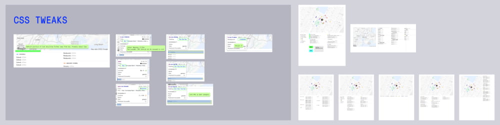
I met with the Global UI team to make sure I was using consistent design patterns and existing elements, and any new elements could be worked into the Compass global styles, for others to use.
I also met with Compass’s graphic design team, as the map feature would be heavily used in print media, and they created the templates and design assets that are used by Agents.
MVP Launch
Through close coordination with the engineering team, we launched the feature for a select number of agents to get more detailed feedback and see longer term results.
This launch allowed us to view usage patterns through FullStory as well.
Output
There were several permutations of this feature
Editing View: Compass Designers
For the design team to use in creating new design templates that agents can use
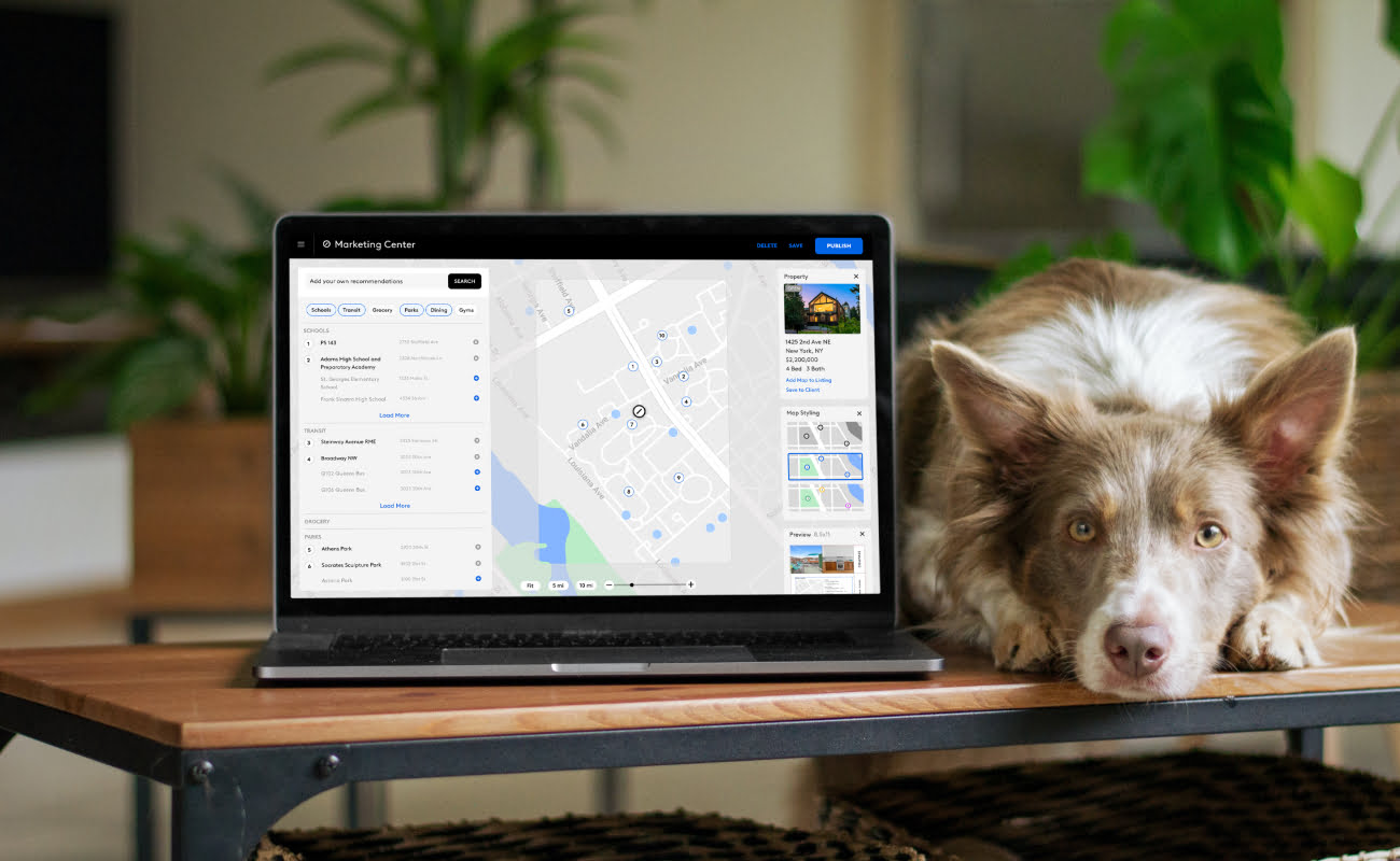
Editing View: Compass Agents
The primary use of this view is for agents to select locations and nearby points of interest in existing templates with this feature, add it to new documents or create their own designs.
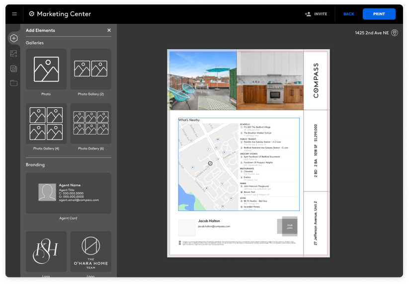
Output: Print
The maps needed a standardized look for how they’d appear on printed media, in color and/or black and white
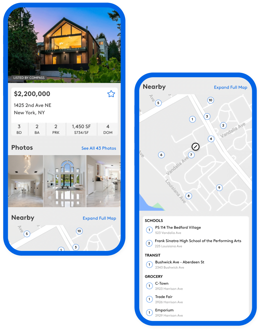
Output: Digital
This tied the look and feel of the printed media to the web listings, as Compass prides themselves in well defined, and well designed branding.