A collaborative process to create a feature that lives seamlessly among a family of user-friendly design elements.
Client:
Compass
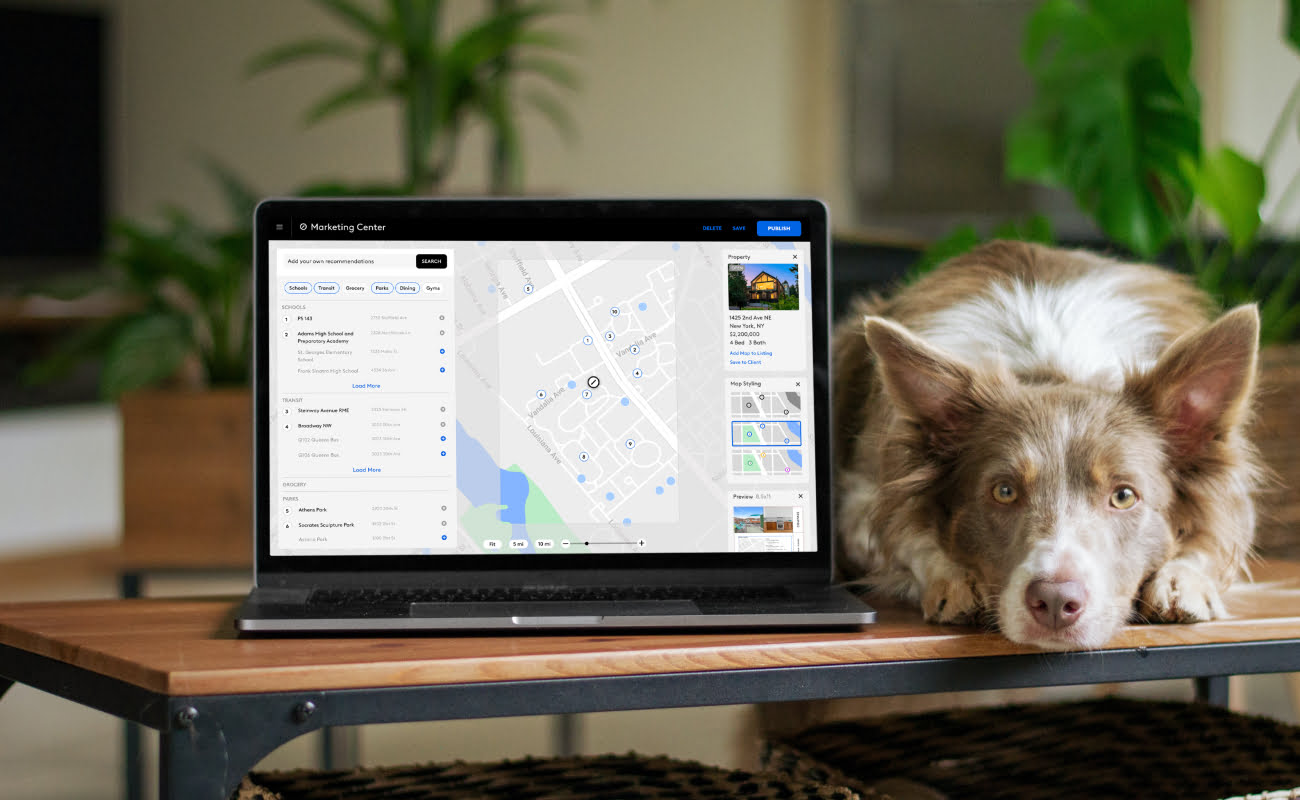
Points of Interest Map Feature for Design App
Industry: Real-Estate, B2B, B2C
The Challenge
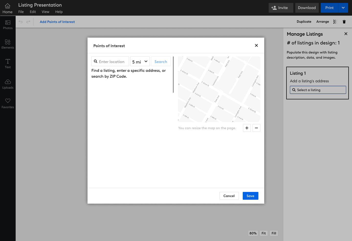
Creating a detailed component that can live seamlessly among other layout and design components for real-estate marketing materials, to show points of interest near a specified listing.
The Solution
By working with users and fellow designers on the team, I created an easy method for agents to add points of interest maps to print and digital materials, and customize what each map displays.
My Part
I defined the MVP, created prototypes and ran usability workshops with Compass agents to validate the design direction and make iterations, and hand it off to development.
Building into an existing framework
Compass created a very in-depth system for agents to make all the communication materials they need. This system has a defined framework so new features must adhere to the existing structure for consistency.
The Points of Interest Maps feature had to be able to focus the user on the task of setting up the map, and make each step easy enough to jump into if they need to make later edits.
Quickly build and test
The need for this feature came from requests from Compass agents, so there was a list of desired features upon starting the project.
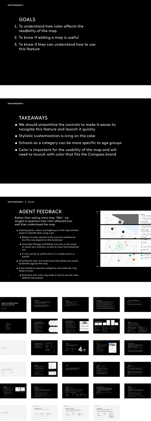
I created an initial prototype based on those requests, and was able to conduct usability tests with some of those same agents who requested the feature.
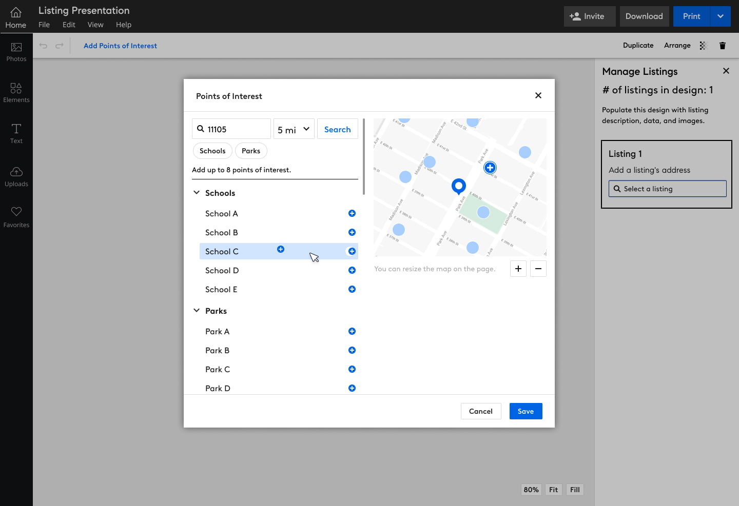
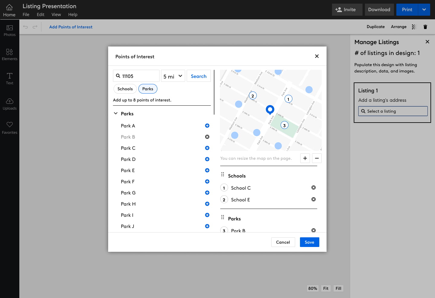
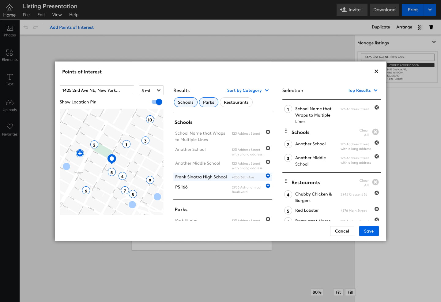
What we found were that different regions might prioritize different categories, as well as depending on the clients, so it became a priority to make that easily customizable.
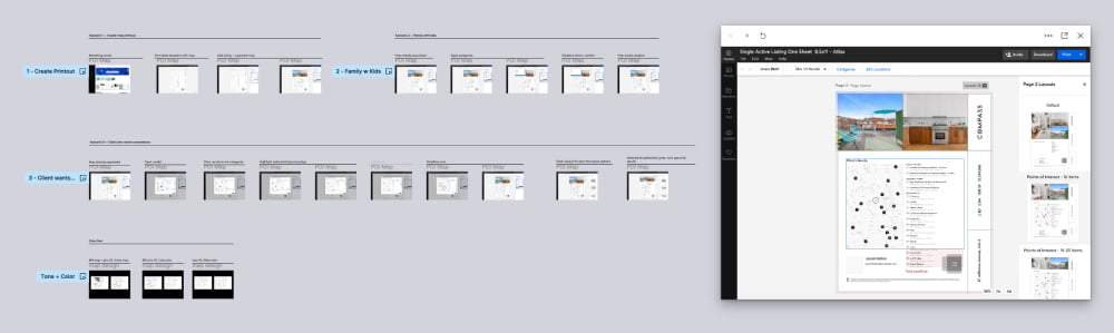
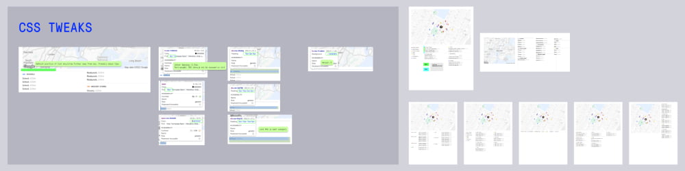
Usability Testing & Iterations
The information from testing was invaluable to direct the next several iterations of design as I worked with other teams in Compass to ensure the design patterns and standards were congruent with other features and products at Compass.
I met with the Global UI team to make sure I was using consistent design patterns and existing elements, and any new elements could be worked into the Compass global styles, for others to use.
I also met with Compass’s graphic design team, as the map feature would be heavily used in print media, and they created the templates and design assets that are used by Agents.
MVP Launch
Through close coordination with the engineering team, we launched the feature for a select number of agents to get more detailed feedback and see longer term results.
This launch allowed us to view usage patterns through FullStory as well.
Final Designs
Output
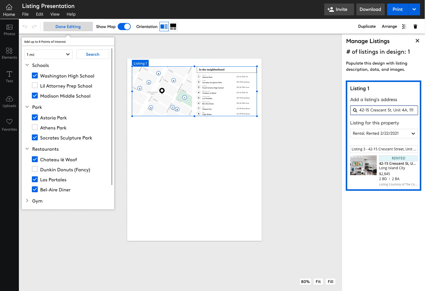
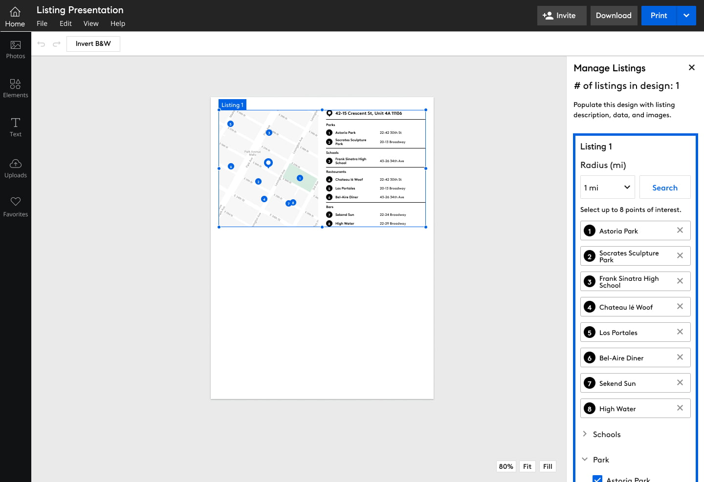
There were several permutations of this feature
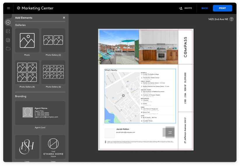
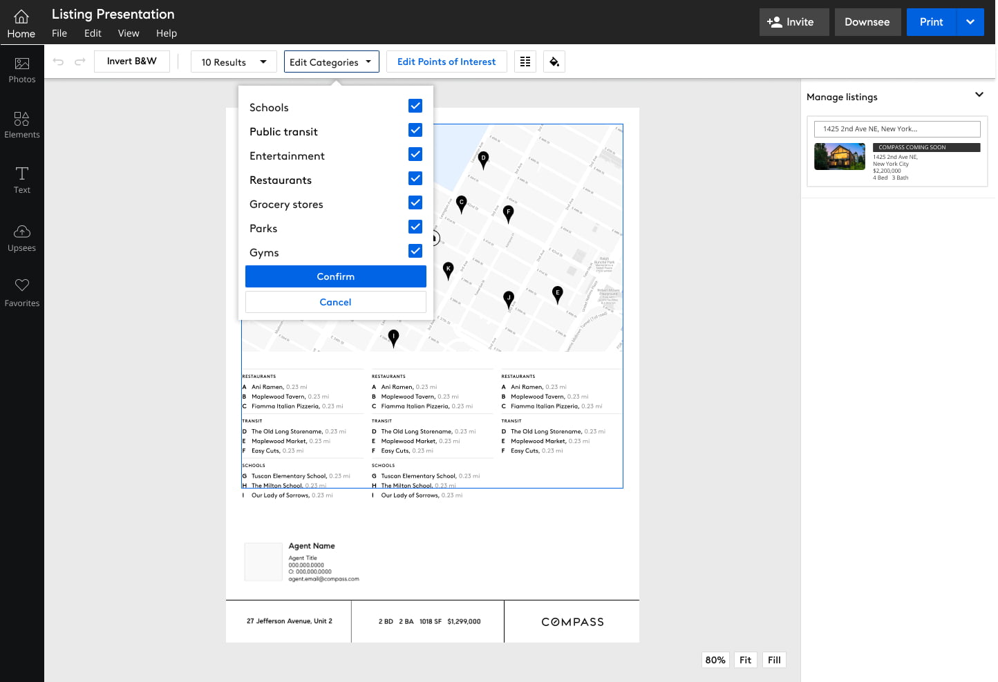
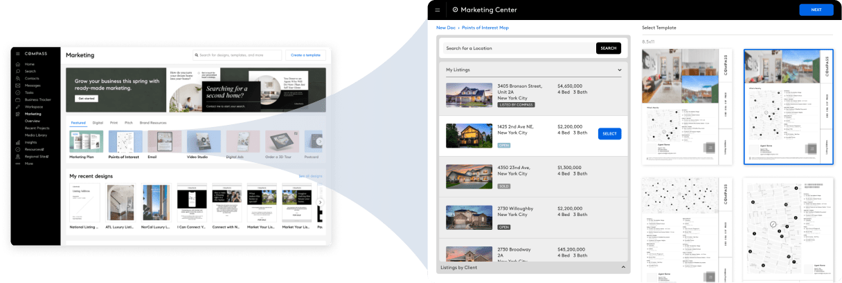
Editing View: Compass Designers
For the design team to use in creating new design templates that agents can use
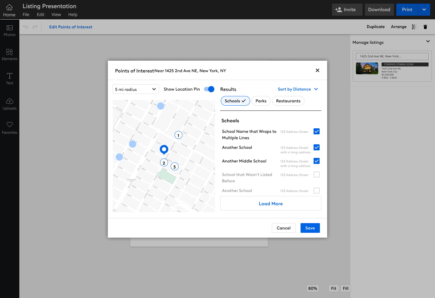
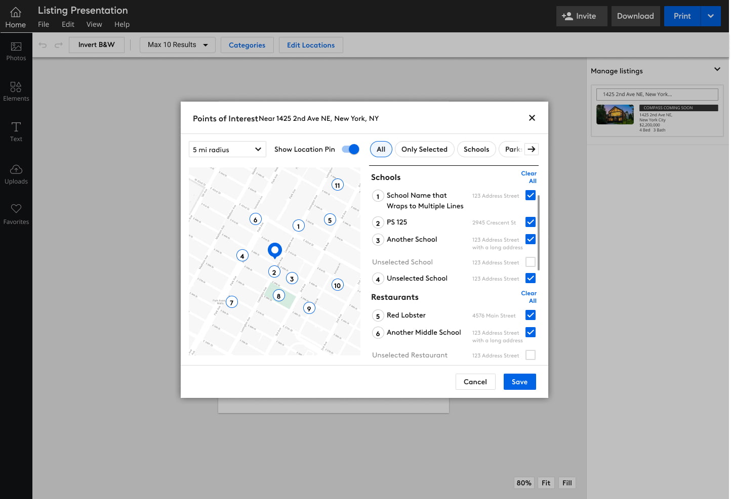
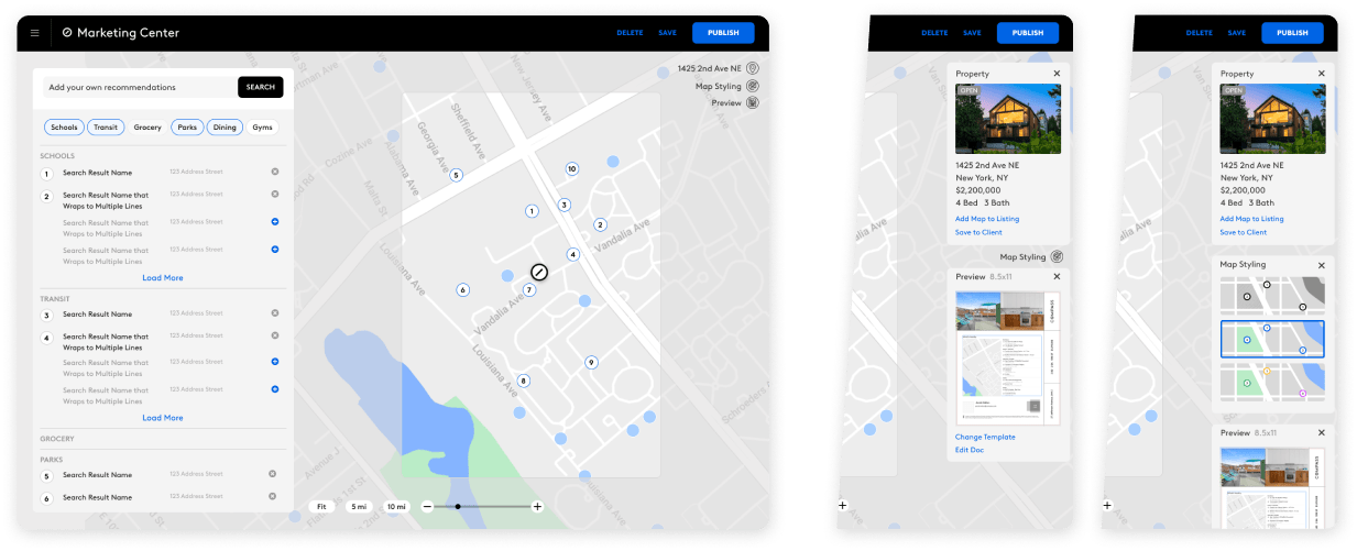
Editing View: Compass Agents
The primary use of this view is for agents to select locations and nearby points of interest in existing templates with this feature, add it to new documents or create their own designs.
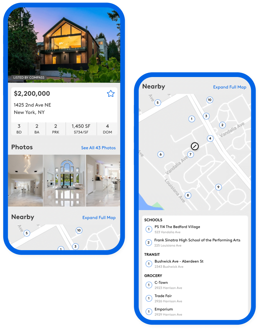
Output: Print
The maps needed a standardized look for how they’d appear on printed media, in color and/or black and white
Output: Digital
This tied the look and feel of the printed media to the web listings, as Compass prides themselves in well defined, and well designed branding.